Review: 100% Design
Our hot picks from 100% Design.
100% Design delivered a knockout show this year, with impressive displays from exhibitors across the board. Ambushed by eager designers and waylaid by wonderful objects it was easy to get overwhelmed in the throng. With beautiful things at every turn, I got lost trying to find my way back to Print, Tuft & Fold. Expect an interview with the lovely ladies soon. There were spectacular displays of both home grown and international design talent. Wandering about in a beauty-induced trance, here are just a few of the things we homed in on.
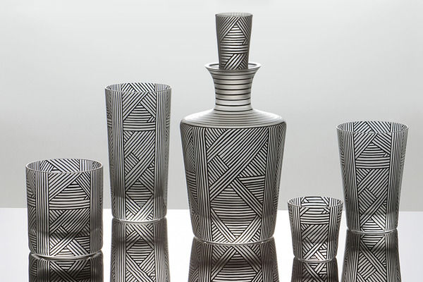
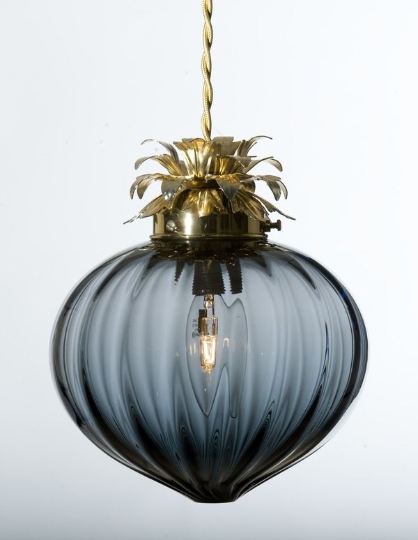
Czech Selection showcased some fabulous glassware including a sleek new collection by Bohemia Machine, featuring stylish angular forms and tactile bands of raised glass dots. Karen Feldman of Artel launched a new collection in partnership with graphic designer Natalia Ogneva. Featuring an intricate pattern of parallel and diagonal lines, the Sequence collection is reminiscent of early 20th century Czech cubism. ‘One of my sources of inspiration for Sequence was the work of Czech-born designer Josef Hoffmann…In particular, his extraordinary feel for lineation’ says Ogneva. Incredibly, each black line in the lattice-like pattern is hand-painted on to the mouth blown vessels. You can find Artel glassware at Paul Smith in the UK. Representing the best of British, RCA Alumni Rothschild & Bickers unveiled a beautiful range of glass light shades. The new Flora collection features delicate bauble light fittings topped with gold pineapple-like leaves. With glorious golden fringing, the domed Tassel Light and fluted Vintage Light have a nostalgic feel, while the distinctive colour palette - teal, gold, black and grey – gives the whole collection a contemporary edge.
At 100% France, I was struck by Atelier Polyhedre’s bold shape-shifting ceramics. Flying the flag and looking particularly dapper, Baptiste Ymonet and Vincent Jousseaume are the creative duo behind this quirky design studio. Fluctuating between minimalist rigour and baroque exuberance, between the geometric and the organic, Vincent and Baptiste have created a fresh and original collection, experimenting with form and style while retaining absolute quality. Stopping to grab a bag for all the ephemera I’d amassed, I spotted Scandinavian Surface exhibiting at 100% Norway. The four Bergen-based designers behind the brand recently launched an innovative new wallpaper concept. PanelPiece is a series of individual wallpaper panels designed to be used separately or in combination. Each panel has its individual identity and used singly will reveal a larger overall design. Mixed and matched, the different designs strike up a dialogue allowing you to create a customized wallcovering.
A cohort of British designers showcased their work as part of Design Event North East, representing the best of contemporary design across the region. Michael Armstrong of Afid Design exhibited a breath-taking collection of bespoke timber furniture. Michael’s designs highlight the beauty of simple forms, celebrating expert craftsmanship, quality materials and subtle detailing. I’m saving up for the sideboard. Design polymath and all round mischief-maker Dan Civico was on hand to demonstrate his artful ChairKit_. These AirFix-like self-build chairs and tables are sold in flat-pack/wall-art form, laser cut from a single piece of birch plywood, and are supplied with all the bits and bobs you’ll need for a satisfying afternoon of DIY. Each kit comes with a signed and numbered, limited edition screen print.
Hidden Art was also supporting emerging talent with its fourth Hidden Art Select range, featuring the work of seven British designers. One of my favourites was Your Placemat or Mine? by Hannah Dipper and Robin Farquhar of People will Always Need Plates. Featuring eight designs, the new range celebrates British domestic architecture through the ages and can be used either individually or placed together as a table runner, charting the history of British homes. Renata Manau of Biscuit Design evoked the exploits of Winnie the Pooh with her Balloon nesting box. Complete with a four-paned ‘window’, the ceramic balloon-shaped birdhouse is designed to be strung from a tree and features a florescent pink string that dangles away underneath. This year Hidden Art also launched a new collection of seating by five independent designer-makers. It was difficult to obey the polite ‘do not touch’ sign next to DesignK’s Dandelion Stool: a tripod construction with a plump knitted ball perched on top. COAL Design’s fifties-inspired Horrice Chair was another winner, with its lacquered walnut frame and vivid yellow upholstery.
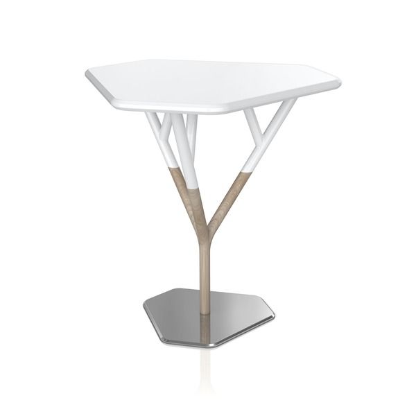
Furniture was a particular draw at 100% Design this year and the impressive selection on show didn’t disappoint. James UK’s range of hardwood, upholstered seating raised the heart rate rather alarmingly, particularly a button-backed fifties-style sofa and a contemporary reinterpretation of the traditional wing armchair. Vitamin launched a new collection of furniture and lighting at the show, of which the Fuse Table was the standout piece. Out of the steel base grows an ash sapling, which splits into three branches to support the white lacquered tabletop. A fusion of geometric and organic forms, and of three different materials, each of the elements feed into one another to create a beautiful, functional object; the tabletop can even be removed to use as a tray. Leading the field in hand-made contemporary furniture, Pinch Design exhibited a beautifully crafted collection with graceful simplicity of form; we’ve got an interview with Russell Pinch coming soon. The influence of fifties design was visible throughout the show, particularly in furniture, so it was great to see the real thing in evidence as well: a much anticipated collection of original Ernest Race designs reissued by Race Furniture. The pipe-toting mid-century designer created the Antelope chair for the Festival of Britain in 1951 and the wonderful lightness of his steel rod constructions articulate the buoyant festival spirit.
It’s a spirit that seemed alive and well at 100% Design. We’ll be following up on lots of the exhibitors in the next few weeks.


