The Colour of the Year 2011: Honeysuckle
Pantone Colour of the Year - Honeysuckle 18 - 2120
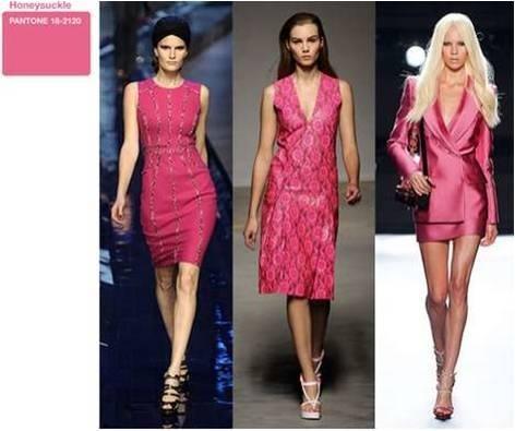
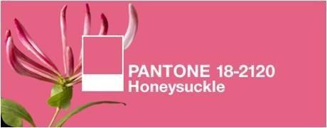
Pantone, the emperor of the colour world, has decreed that Honeysuckle 18 – 2120 is the colour of the year for 2011 and it’s little wonder why. It’s not even February yet and we’ve already been hit by increased VAT, atrocious weather and depressing stories in the news. But, fear not – Honeysuckle can help us through the horrendous winter mire.
“Honeysuckle is a captivating, stimulating colour that gets the adrenaline going – perfect to ward off the blues,” says Leatrice Eiseman, Executive Director of the Pantone Color Institute. “Honeysuckle derives its positive qualities from a powerful bond to its mother colour red, the most physical, viscerally alive hue in the spectrum.” This makes it perfect for beating the January blues and providing welcome distraction from failed New Year’s resolutions.
Honeysuckle has the power to uplift and embolden, and as the importance of environment for one’s wellbeing is undeniable, it’s well worth introducing a dose of this vibrant beauty into yours. Eiseman also says that the “intensity of this festive reddish pink allures and engages. In fact, this colour, not the sweet fragrance of the flower blossoms for which it was named, is what attracts hummingbirds to nectar.” If we apply this principle to interior-design, honeysuckle in the house means that your home will become a hive of social activity – perfect for boosting the spirits in troubled times.
Honeysuckle is, essentially, a glorious meshing together of red, the colour of passion and courage, and pink, the colour of softness and femininity. This means that it’s perfect for men and women alike, and its cheerful, reddish-pink hues will look great in both male and female homes. A splash of honeysuckle is just the ticket for a dash of dynamic decorating: rose-tinted spectacles for the interior. It is, says Pantone, the colour of “verve and vigour”, and will instil in us the “confidence, courage and spirit to meet the exhaustive challenges that have become part of everyday life”.
And, despite its strong and vibrant tones, it works fantastically well with a huge variety of other colours. Setting it against a neutral palette will make the colour really pop – imagine this Mosaic Silk Cushion from Heals on a pale sofa or chair. The contrast between the two would be fantastic, and as we’ve all got a piece of furniture that could do with a lift, choose honeysuckle as the colour to reinvigorate yours. It also looks brilliant set against a punchy turquoise (ironically, turquoise was Pantone’s colour of 2010). That might sound a little over the top – but trust me, it looks fantastic. Turquoise is, says Pantone, the colour of “escape”, whereas honeysuckle is the colour to spur us on through the challenges of modern life. So, the two together are a great combination for the home that demands both calming and energising. I also think that honeysuckle and orange look brilliant together, and as colour-clashing is set to be huge this year, very on-trend too. Again, you might think that the combination of the two could be hideous, but it truly works (probably because they share the same mother colour). If you’re still not convinced, check out the amazing Clarissa Hulse Larch Amber and Fuchsia Silk Cushion from Heal’s and you will be very surprised indeed.
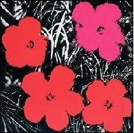
If you’d rather have your honeysuckle in a more artistic form, consider introducing a print of the fantastic Andy Warhol Flowers Red/Pink into your home as a great focal point for any room. Warhol is synonymous with being utterly cool, and he clearly recognised the power of honeysuckle hues way back in 1964 – thus, we know honeysuckle belongs in trendy interiors. Pantone also say that honeysuckle is “guaranteed to produce a healthy glow when worn by both men and women”. This is the perfect reason to paint a wall of a room or your hallway with this delicious colour; it’ll be like an instant detox (never a bad thing after the excesses of the festive season).
So, there you have it. Honeysuckle is the colour of the year, and it’s a rather wonderful thing too. A colour to elevate, soothe and inspire; what more can you ask for? In the words of Pantone, it’s “a colour for everyday – with nothing ‘everyday’ about it”.


